What colours are trending for 2023?
With holidays on the horizon, bringing uplifting and warm seasonal hues into your home is a huge trend for spring and summer. Alysha said: “Sun-baked tones like clay, terracotta, ochre, amber and tan look good all year round and bring depth and richness to your room. They are the perfect paint colours for a new home to instantly transform those stark white walls.''
“Greens are also everywhere this year in a range of shades from bright matcha and organic forest hues to more subdued olive greens and khaki. Continuing the natural vibe, we’re also using brown as the ‘new grey’. Brown is not to be feared, it’s a great option for a neutral to sit alongside stronger colours.”

What are the three best colours that go together?
When choosing your paint palette, it’s good to keep in mind colour’s key roles in your home: conveying reassurance and bringing an element of escapist fun.
Alysha said: “Colour is one of the ways we can use interior design to create positivity and foster an overall sense of wellbeing in our homes. But it’s also a great way to introduce novelty into your design and do something different.''
"There are no set three colours that go together. However, the easiest way to identify complementary tones is to use a colour wheel. This can help find tonal palettes or shades with a similar compound that harmonise well together.''
''Airy tones will uplift and lighten contemporary home furnishings, while natural influences will continue to inspire grounding neutrals, dense vegetal hues and rich forest inspired hues. Electric brights are also injecting eye-catching vitality into contemporary design,” Alysha added.
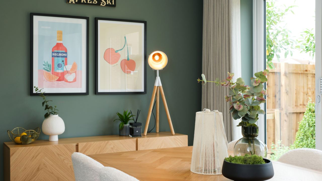
Our favourite accent colours to add a pop of colour
The accent colours you choose in a room are pivotal to the mood you want to create and adding a pop of colour to a new home is a quick way to personalise a blank canvas.
I love a deep indigo colour for painted walls, and other blue-based tones, particularly if you’re looking to impart a sense of sophistication and luxury. Textured black and pure black can also work together on organic surfaces to create provocative statement pieces.
It’s still possible to use accents and keep your colour-scheme on the neutral spectrum. Nuanced neutrals like warmed-up tans and deeper caramel tones will help create a timeless aesthetic alongside off white and fawn tones. You can step this up even further by bringing in richer sun-baked pigments like pink clay-inspired hues to enhance both hard and soft furnishings.
Amber or solar glow are trending terms designers are using to reference beautiful combinations of rich yellows and oranges that can infuse home designs with radiant warmth. We’ve seen variations of the same tone from light to dark being used in ombre effects and layered hues.
Enriched browns also make for a warm and welcoming aesthetic. I would recommend exploring deep earth tones combined with nourishing botanical greens to really bring the beauty of nature into your interior space.
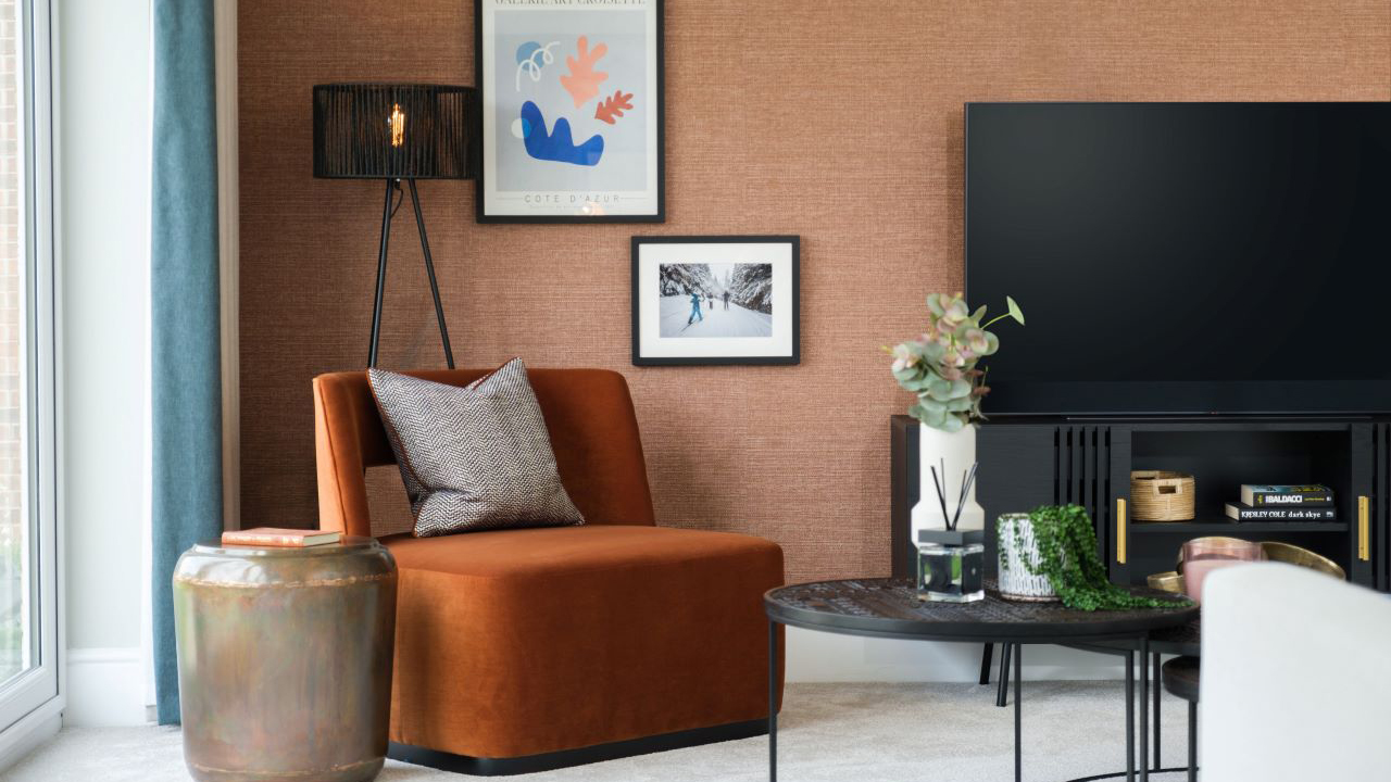
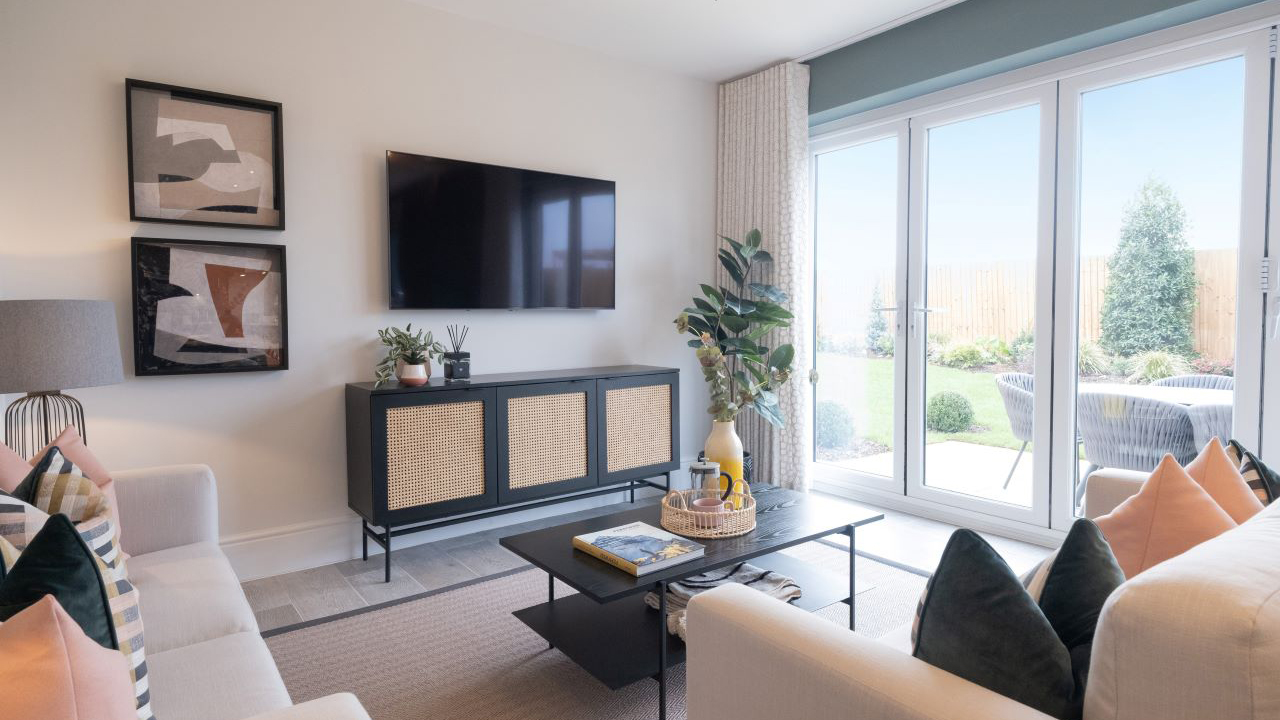
Paint colours for your living room
"Expressing personal style is a creative process,” explained Alysha. 2023 is about discovering you can do it every day. Even if an item is old, you can style it to create something that feels new or buy complementary pieces that give it a new identity. Adding paint colours to your walls can also transform the look of your existing furniture. You could even opt to use the same colour to paint shelving for the wall too.''
Wallpaper or paint colours can also be used to ground your room, so if you have statement or ornamental pieces of furniture, think about what tones will anchor them together. When looking at colours to paint the living room, an accent tone works well over one or two walls, for example behind the TV and sofa, then you can apply a warm neutral to the other walls so as not to overwhelm your room. I tend to avoid stark white as it can feel cold.
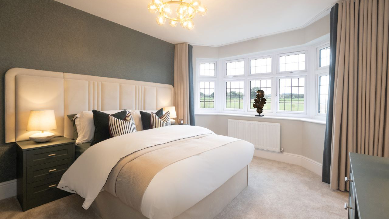
Calming hues for bedrooms
When it comes to paint colours for bedrooms, natural shades are most conducive to sleep, according to Alysha. Dulux’s Colour of the Year for 2023, Wild Wonder, is “a positive, glowing tone, inspired by the natural world” and brings the perfect laidback feeling to a bedroom. For a warm and cosy bedroom, I love honey-coloured neutrals, clay pink, taupe and quartz grey. Cooler accent colours in a range of blue and green hues are also really relaxing for a bedroom.”
Read more bedroom ideas from Alysha.
The best tones for bathrooms
If you’re using paint in a wet space, it’s important to choose one designed for humidity in a hue that will complement your tiles and bathroom suite.
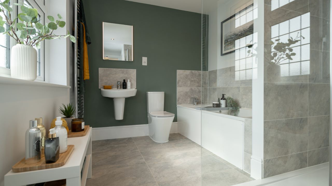
Alysha said: “When we design wet spaces, I always start by choosing the tiles as understanding the tone and texture of the tiles helps with choosing paint. Neutrals always work well as bathroom paint colours. I like to use elevated neutrals like; fawn, warm stone and biscuit tones. If you’ve opted for half height tiles, you can warm up your bathroom by adding a feature colour that wraps around all the walls. If you have a neutral tile you can go for a punchy hue like green, deep brown or a rich burnt tone."
What are the exterior house colours for 2023?
The architecture of our Heritage Collection homes is influenced by the Arts and Crafts movement and our street scenes combine traditional red brick designs and white render frontages. Led by Alysha, our interior design team have chosen a beautiful range of front door colours to tie in with the time-honoured exteriors, including navy, sage green or charcoal grey.
Discover more about giving your house kerb appeal.
Paint colour can also bring joy your garden space and brighten up outdoor features like pergolas, fencing, trellis and screens.
Alysha said: “A key trend this year for your outdoor space is to bring the sophistication of your interior design aesthetics outside and adapt your garden for year-round use. Cosy textiles are important for bringing indoor comforts outside. Design innovations are making weatherproof materials feel less synthetic and more tactile. Advances in outdoor lighting design is also helping to bring interior sophistication outdoors and can really bring your exterior colours to life after dark.”

What is the colour for 2024?
Trend forecasters WGSN have highlighted the optimistic tone of Apricot Crush – a restorative, refreshing hue that’s set to bring an energetic feel to next year’s interiors.
Alysha said: “Orange is a zesty alternative to pastels and delivers a nourishing quality to encourage wellness and positivity. Apricot Crush may not be the obvious colour choice for everyone, but it’s got so much to give. It feels lush and fruity, while also being grounded as an evolution of terracotta and pigmented clay."
Although it’s right on trend, you can’t fail to enjoy its cool retro vibes, which play into the 70s revival movement, and it oozes sophistication when paired carefully with tonal pastels.
Get more new home inspiration and discover our favourite interior trends for 2024.


